At SourceFire, among other things, we build a cloud based Advanced Malware Protection software. As security products go, we collect a huge amount of data about events that happen on the user devices so we can identify and potentially quarantine malicuous events. Security in itself is a big specialized domain, but this post is about a dashboard that we serve as the main point of entry into the big data that we collect from enterprises and consumers.
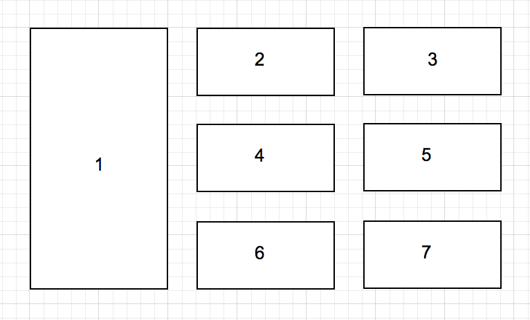
We were debating about what data to put on the dashboard. The target is to offer a very high level, but an actionable view of the whole enterprise data. In the end we settled down with a list of 7 types of data and decided to use a layout similar to the following.

I was looking at the metrics this morning to see if our prioritization of the layout tiles made sense to the users and found that
the number of clicks on each widget is highly correlated to its relative order in the layout.
I am not sure how to interpret this result. It may mean one of:
- The ordering of the tiles matches the actual priority of our users.
- Irrespective of the contents, users are more likely to click on data in this order.
- The results are totally random and it’s more of a coincidence over a correlation.
At this point, I feel we need to shuffle the tiles to see if the position has a strong bias on the results. When I get a chance to do this, will post again with my findings.